The primary goal of most websites is getting users to sign-up or register. It may include registering for an account, creating a loyalty profile, providing information to register for a free trial, etc. However, registering on a new website is pretty tedious and may take some time for users.
When you ask customers to register, you should bear in mind each additional field you are asking them to fill out. The more fields the customer has to fill out, the more it will lead to a high drop-off rate.
Let’s take a deep dive into the redesign of Carrefour Belgium’s sign-up process that led instantly to higher conversions!
Avoid getting too personal
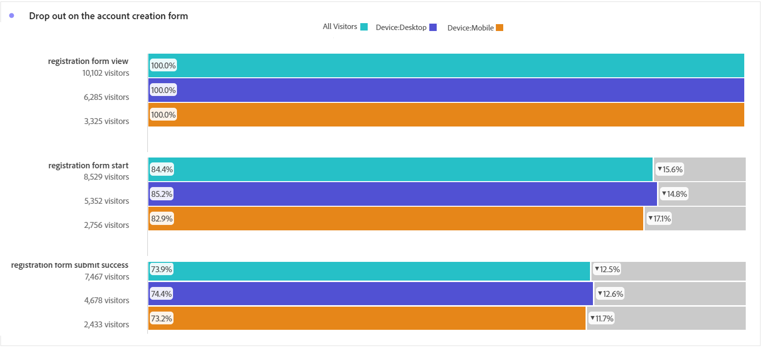
Even if the number of fields isn’t the only factor that leads to a high drop-out rate, long forms asking users too many questions are “user bounce machines”. We could illustrate this by giving you a comparison between Carrefour Belgium’s drop-off rate before and after the redesign: we went from a 60% drop-out rate in March 2020 to 25% in June 2020.
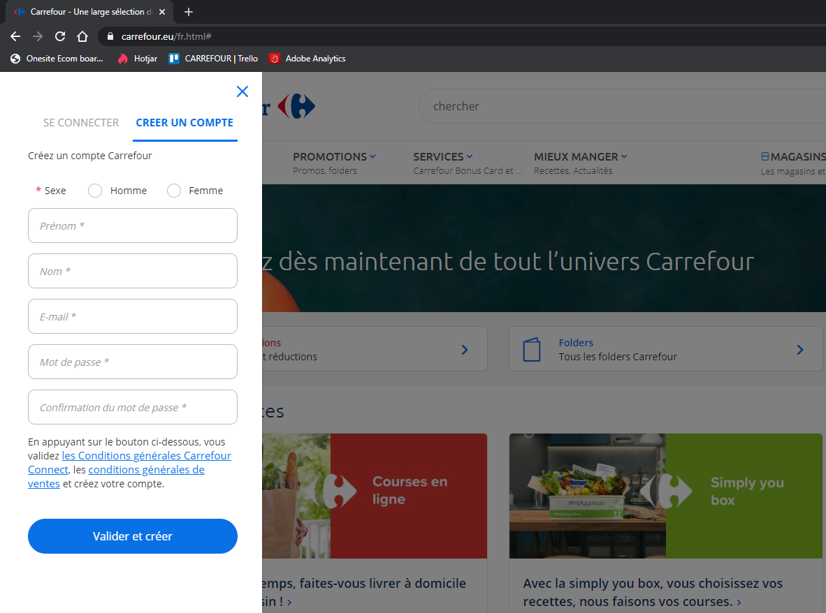
We identified a big issue on the previous registration form we had. Indeed, it was containing at least 20 different fields. For many, as well as for Carrefour Belgium, the initial goal is to encourage new customers to provide information that helps personalize their experience. However, by asking for too much information, customers may feel an invasion of their privacy and might wonder why that much information is needed.
Keep the sign-up simple
Instead of asking unnecessary questions at the beginning of the customer’s registration journey, we decided to simplify the registration form. Since then, we’re only asking essential information to complete the process. We are still able to gather additional information at a later stage of the shopping experience. This enables us to have a two-fold registration process.
Having our customers’ trust is of great importance. That is why we decided, prior to asking our customers all the information we need from them, to let them have a look at our retail e-commerce website. All the questions concerning the customer’s address, mobile number, user preferences and eConsent were removed from the first part of the registration form, it comes at the second stage! In other words, this short first registration enables customers to benefit from all the advantages of our website before confirming their interest by completing the rest of the registration form. Our main focus here was to deliver a satisfying e-commerce customer experience.
Adopt a data driven Design process
Based on a customer centric and data driven approach, we started working with a mixed team of IT & UX/UI to reconfigure the sign-up/registration process to improve conversion. We compared the first time user flow with the data from analytics and heatmaps. It became obvious that the drop-off was occuring on the page where we asked users to provide detailed personal information.
While this information was shared with the business, we started to optimize the users’ experience. We also began to spread the same process around all Carrefour Belgium’s platforms; whether it is our websites or our mobile app.
We decided to cut information requests down to a minimalist form and place the loyalty profile completion as an optional form. In addition to that, we:
- Introduced a digital loyalty card linked to the created account,
- Reduced the questions from 20 to 5 thus giving customers an option to skip the lengthy form.
Set expectations
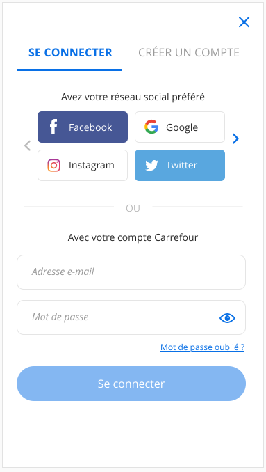
No one likes being “caught off-guard” by a lengthy or confusing signup process. Consequently, we are giving the possibility for our customers to login using their social media accounts, on top of the regular “two fold” signup described earlier.
First of all, it is a widely adopted method allowing the use of popular social networks to authenticate. Secondly, it eliminates the need to create a separate set of credentials for a specific website or mobile app which facilitates the user experience.
It is way quicker for customers to authenticate through social media accounts than creating an account from scratch! And we’ll make it possible while respecting all the security requirements (GDPR friendly).
The best sign-up experiences might be the ones you don’t notice!
The registration process is a key step of the customer journey. It will establish a trust relationship between you (the company) and your customers. A great user experience will help customers to start their shopping experience in the best conditions possible.
A quick view at the impact we captured
Here are a few (interesting) KPIs I wanted to share with you:
- Reduction of the bounce rate of over 58%, almost immediately,
- The conversion rate went up from 40% to 75%,
- And, as mentioned above, the drop-out rate went down from 60% to 25%.
To conclude, I would like to summarize the rules that we followed (and that worked for us!) to increase our conversion rate:
- Keep the registration form simple by only asking essential questions,
- Minimize the process and the number of steps required to sign-up,
- Rely on data and customer feedback,
- Eliminate all possible confusion for the customer during the whole process.
Check our other articles about e-commerce projects.